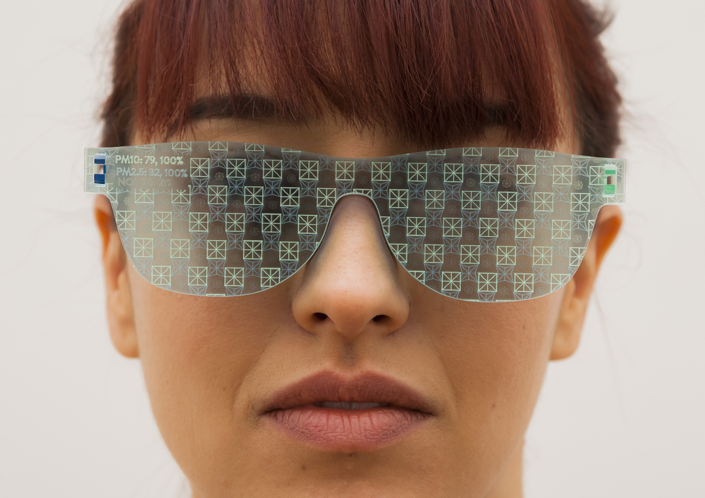
This november the future laboratory “School of Machines, Making and Make-Believe” is returning to ACUD with a workshop program focusing on data and digital narration. How can we create meaningful experiences using data to explore the facts and fictions of our modern-day lives? How can a thoughtful and more personal exploration of data visualization and storytelling provide new ways of understanding the world around us and ourselves?
Two of the instructors will be the UK-based design-research duo Stefanie Posavec and Miriam Quick. They have been immersed in the world of data, design and information graphics for the past several years. Stefanie’s personal interests have focused on the visual representation of language, literature and numbers. Miriam’s interests have led to research and an ability to find data and facts, digest them and build them into compelling stories. Together they complement each other’s work and are great friends to boot.
Hey you two! Please describe each other in one sentence.
Stefanie: I try not to have debates with Miriam because I will always lose… she is so knowledgeable it both amazes and scares me!
Miriam: Stef is constantly excited by everything – it’s infectious!
You’ve mentioned you collaborate together quite often, how did that come about and what is it about working together that keeps you both coming back to each other?
Stefanie: We were friends first outside of working together so working with Miriam is nice way to see her more often! We divide the work between the two of us down data/design lines with some crossover, but I think this really works because we both respect the other’s skills: Miriam is an excellent data researcher and journalist.
Miriam: We are actually really good friends. We met back in 2008 when I was putting on a music event with my husband under the guise of it being an art show – the venue needed to have exhibits so it didn’t need to get an events licence. So we invited loads of artists to create pieces on the theme of ‘analogue’. Stef’s was by far the best. She created her Measuring Kraftwerk poster, which I now have on my living room wall.
I like working with Stef because she has really high standards so she indulges my nitpicking. Also, she’s the best designer I know. When we work together, I can totally relax because I have complete confidence that what she produces will be good.
How did your interest in data come about? What aspects of data are most fascinating to you and why?
Stefanie: I enjoy working with data because I like creating design systems where variable inputs create variable but related outputs, and data is the natural ‘input’ to use for this. Also, working with data provides so many chances to learn new things, it never fails to be interesting.
Miriam: Data is like a lens you can use to discover new things about the world – patterns previously hidden or obscured – and make them clearer. But it never tells the whole story by itself. That’s what makes it so enigmatic and interesting – when you keep looking at data, it often raises more questions than it answers. That sounds kind of pompous doesn’t it? Basically, I like finding interesting stuff out.
What work consistently inspires and motivates you in new kinds of ways?
Stefanie: Work that *isn’t* data-related. I try to look outward for inspiration to look for new elements to incorporate into my practice.
Miriam: Within data journalism, I’m going to be boring here and say the work done by New York Times Graphics team, because they’re constantly raising the bar.
What topics are you most interested to explore that you haven’t already?
Stefanie: I tend to generally work with cultural or scientific data, and my projects are quite friendly and playful, so I’d like to work with data to make change, particularly human rights data or data where the focus is on people.
Miriam: I’m really interested in synaesthesia – mixing of senses. Synaesthesia is a brain condition that some people have, but even people who don’t have it can still have what in psychology they call cross-domain mappings – for example between numbers and physical space, where you imagine numbers as lying on some kind of line at fixed distances from one another. It seems to me that data visualization is fundamentally synaesthetic – it’s about transposing numbers into the visual realm, about exploring correspondences. So I’d love to work on a project along those lines. I used to study music and I’m also pretty interested in data sonification although it’s quite a niche thing and I don’t think all the examples of it so far have been successful.
For someone interested in getting in to the field of information graphics and data visualisation, what advice would you give someone just starting out?
Stefanie: Look *beyond* the poorly-designed and poorly-researched pseudo infographics found everywhere online, these aren’t an endpoint to design in this field but are only the beginning. Data viz and information design are just a design problem like any other and should be solved with an open mind instead of a restricted one.
Miriam: From a researcher’s perspective: follow what interests you and find your specialism, but keep your interests wide too. See where it leads. I had no idea when I started doing this that I would end up doing it for a living. Also, learn statistics.